The Moment
Kinfolk came to us eyeing a Seed raise and the public announcement that would follow. Their product was strong. But their brand comms lacked strategic clarity, and their identity used generic visual language that could belong to any tech startup. This undermined the strength of what they'd actually built. Jeet and Kim were pre-raise founders who needed both strategic clarity and a differentiated brand identity, fast, so they could show up credibly. Working closely, we ran a compressed 12-week engagement. Strategy moved directly into creative expression for a swift launch.
The Work
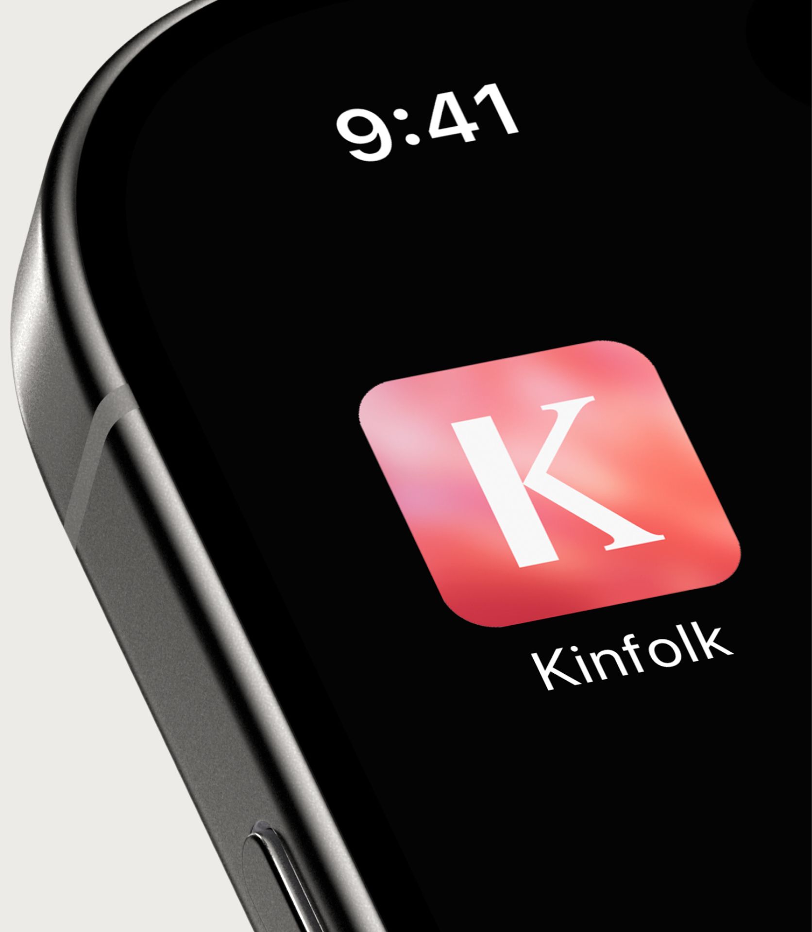
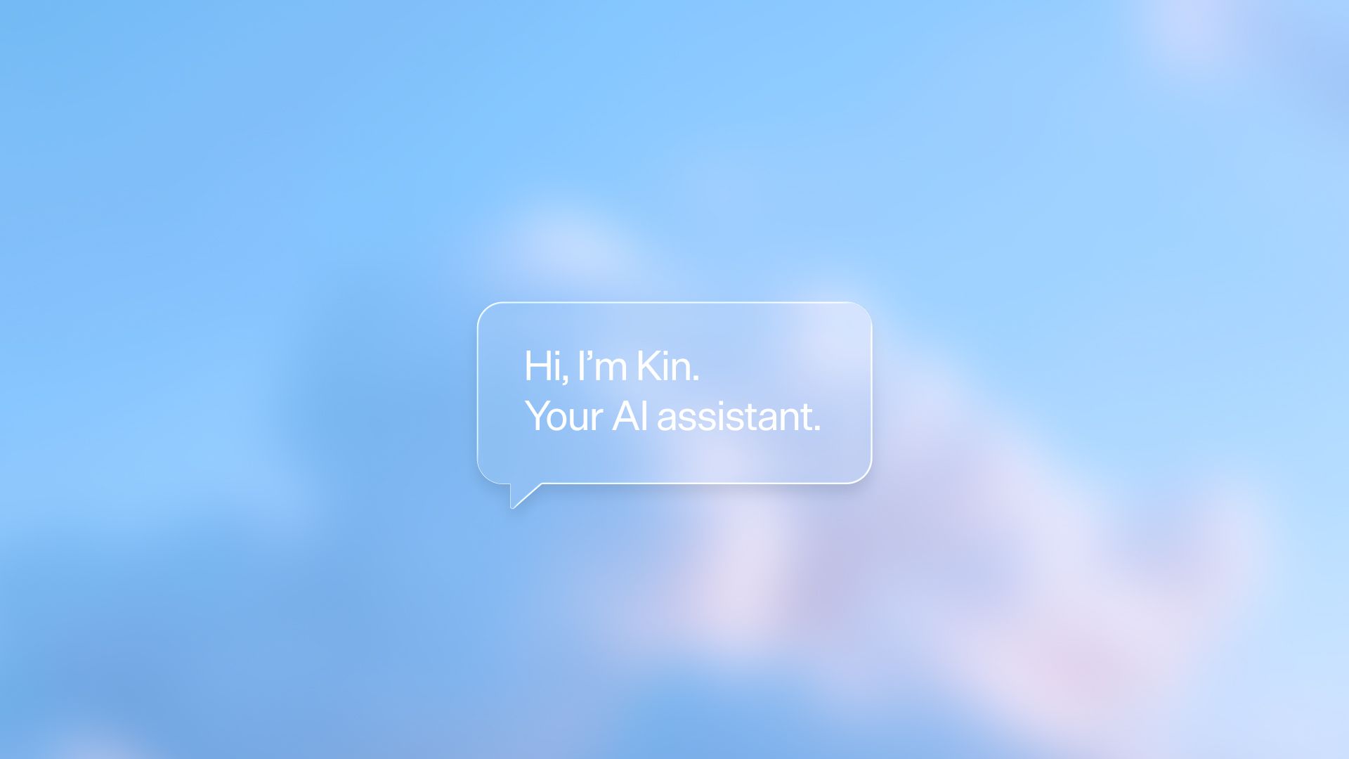
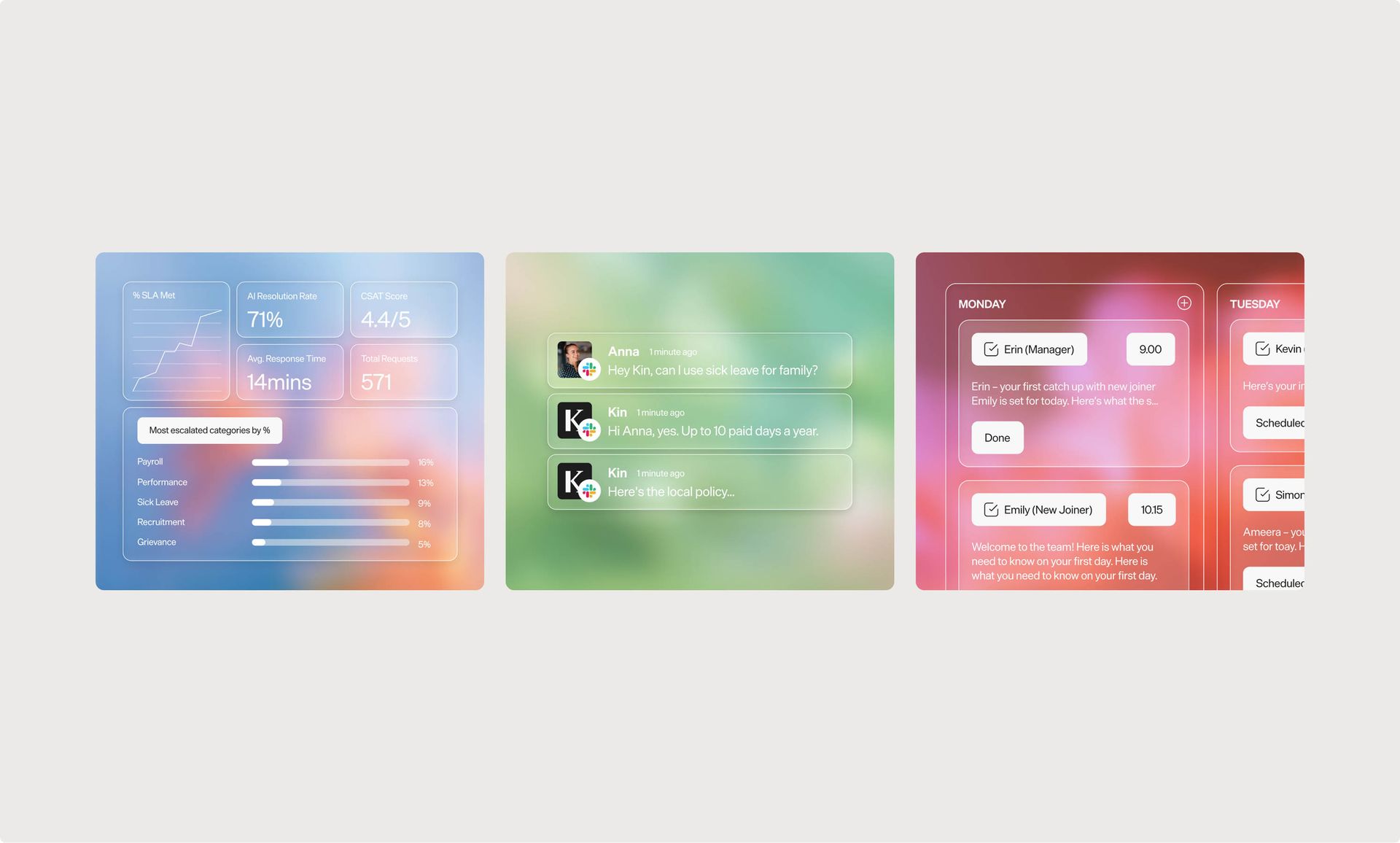
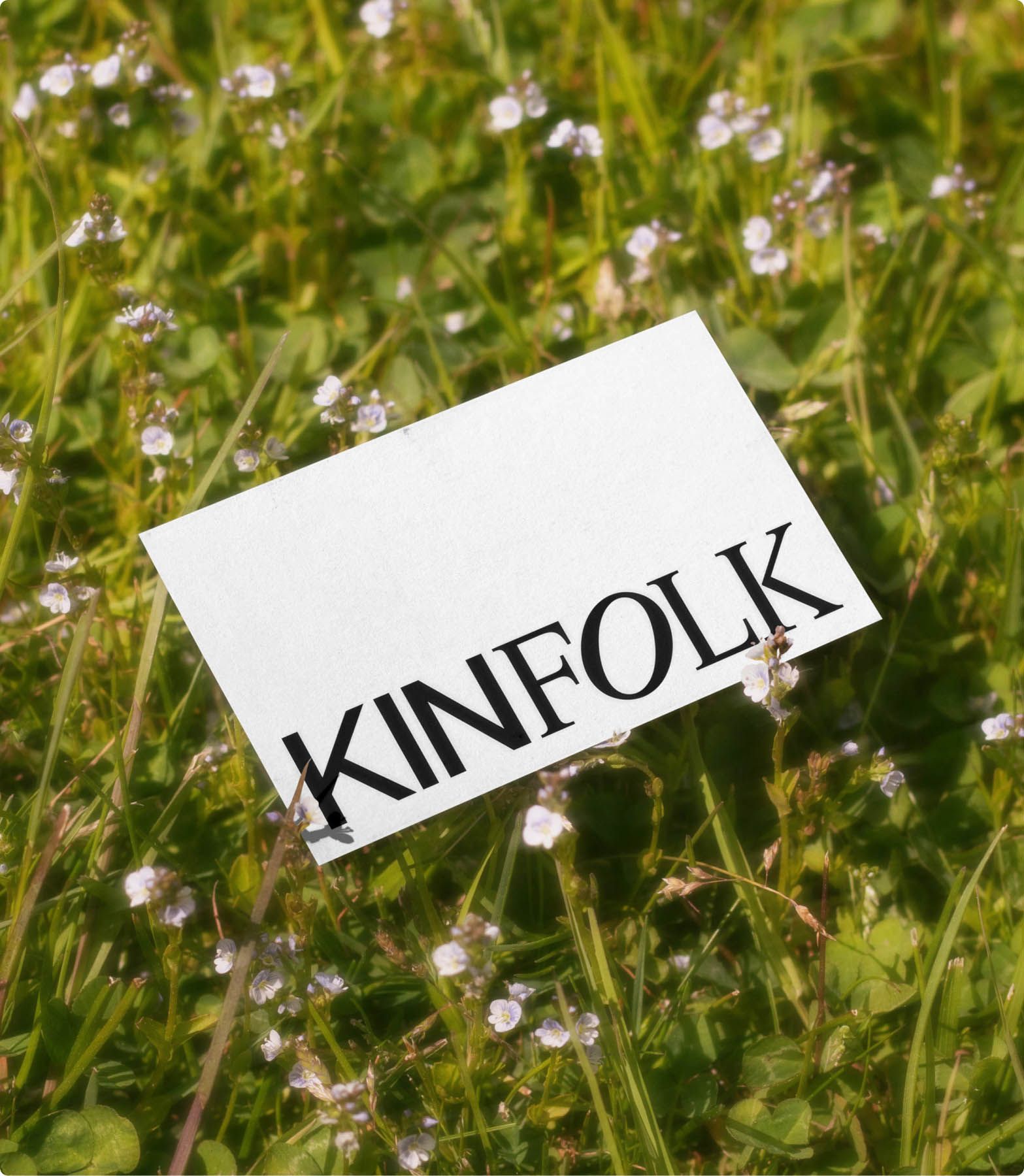
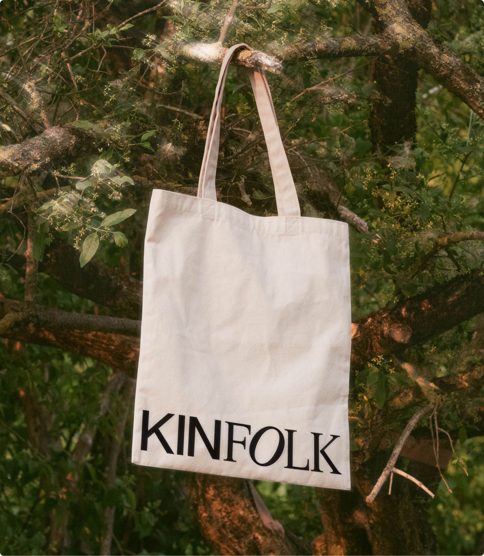
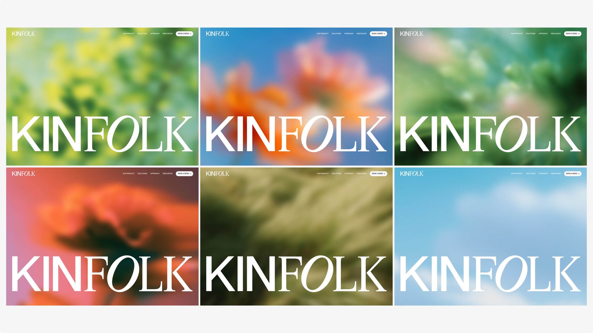
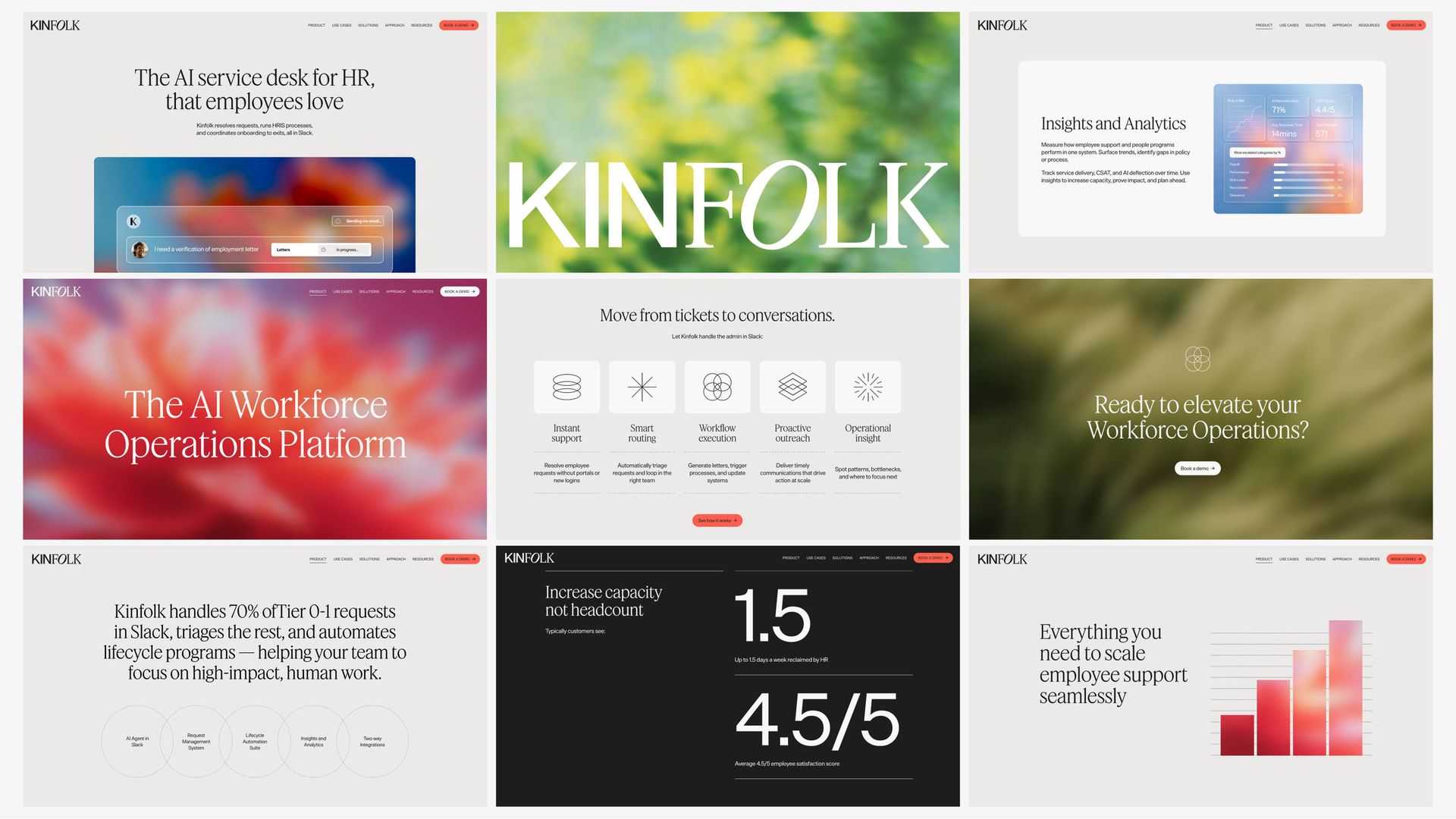
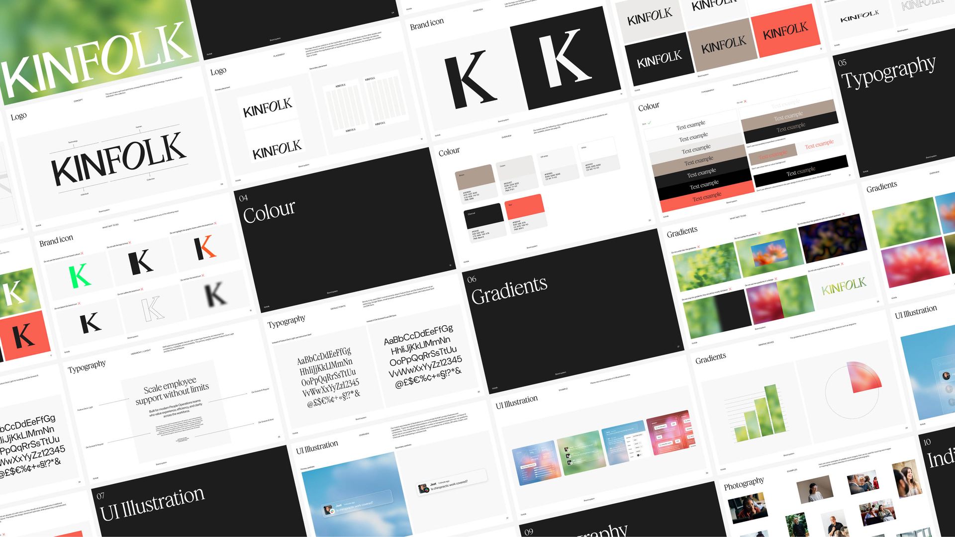
The ambitions and positioning work landed on a simple but sharp reframe: Kinfolk wasn't building another HR tool to supersede the monotony of requests and tickets. It is here to elevate all the human work undertaken in an organisation. Kinfolk see that behind every workforce is a group of people trying to do their best work, not a spreadsheet of resources to optimise. The idea that work could be more human and natural shaped all creative decisions. Kinfolk's new identity used colour and soft-focus nature animation to bring warmth and a distinctly human feel to a famously cold space. The result looked and felt like nothing else in workforce ops. And of course, it wasn't trying to be workforce ops, it was trying to be more human.
The Outcome
The new positioning, identity, and website were in place just in time for Kinfolk's biggest moment yet: the public announcement of a $7m Seed round. Having a brand that matched the strength of the product helped create real momentum behind the business as Kinfolk moved into hiring and wider business expansion.