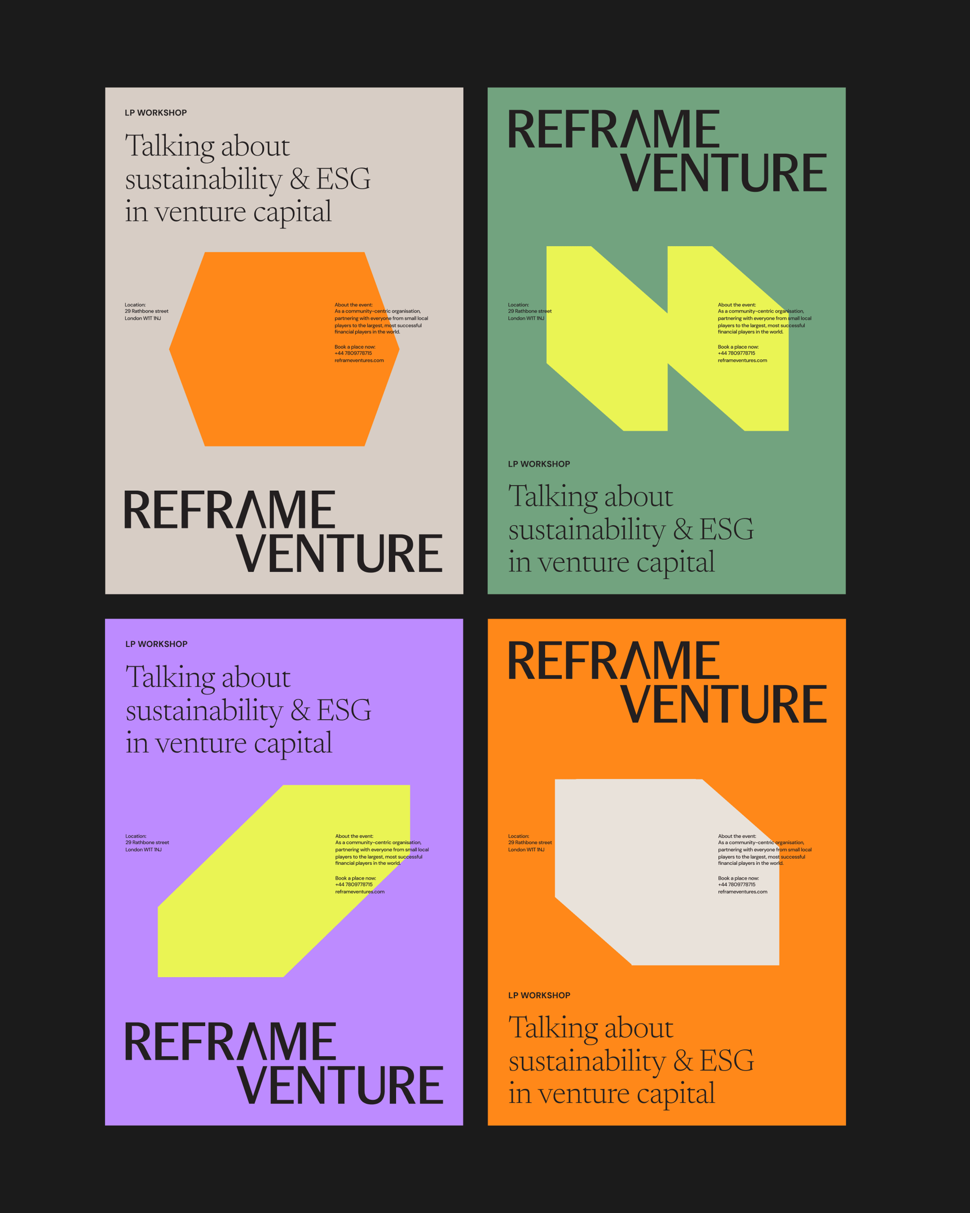
Off the back of a new name, Johannes, Priya and the Reframe Venture team needed a fresh identity to match.
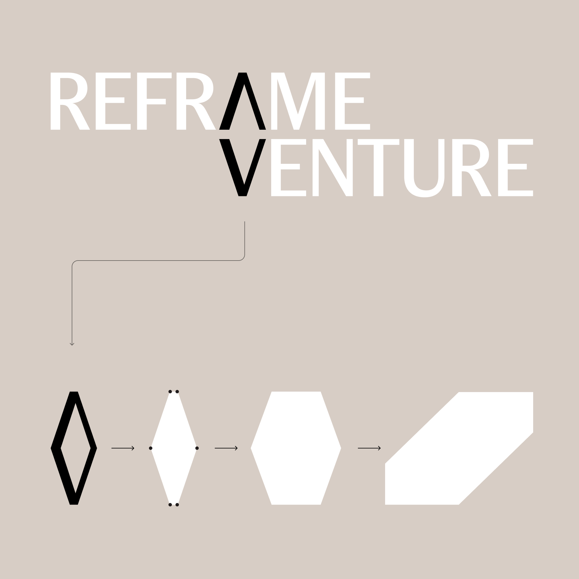
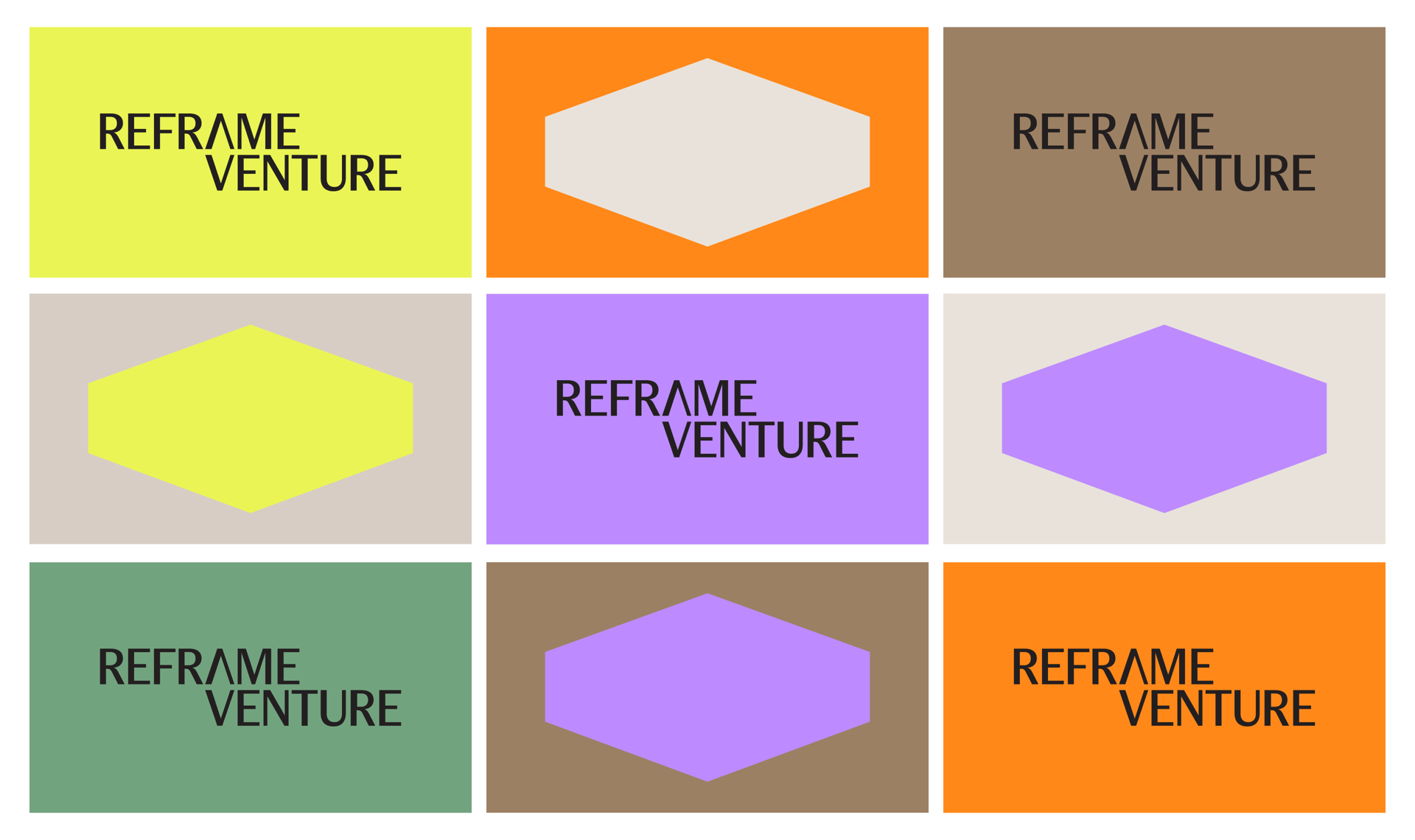
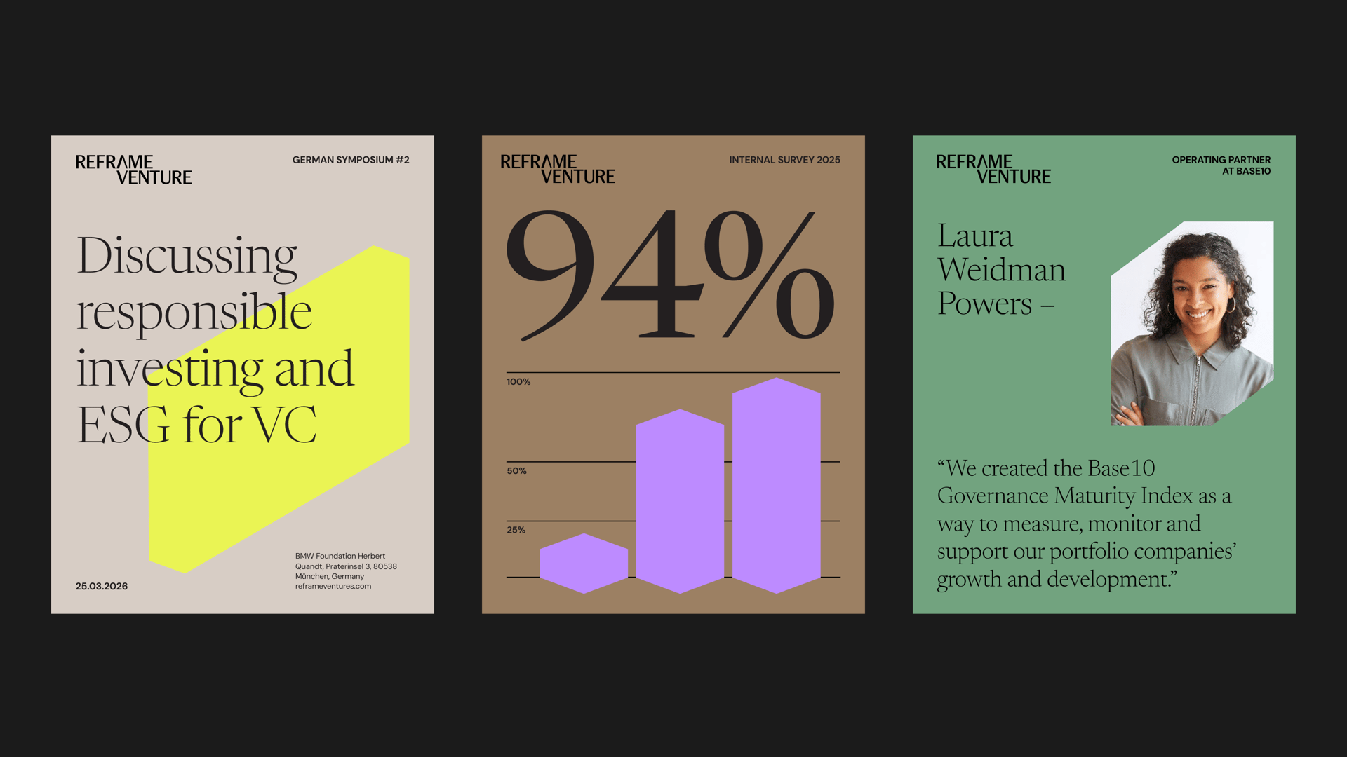
We took the A and V from the wordmark and turned them into a frame, a simple device that morphs into a range of angled forms while always feeling like one family. It gives the team a single recognisable idea to build everything around. A bold palette brings energy whilst elegant serif typography keeps it credible with VCs and LPs alike.